I’ve been getting a steady stream of internship requests lately. Usually three to five a month. Short messages, polite, direct. I open most of them out of curiosity, even though I don’t take interns. I work alone, that’s how my process is built, it’s not something I’m trying to scale.
What caught my attention isn’t the volume, it’s the pattern.
I open the portfolio, scroll for a few seconds, then I already know how the rest is going to feel. Not because people aren’t trying, you can see the effort. It’s because the decisions underneath the work don’t hold up once you look past the surface.
The AI Problem (That Shows Immediately)
And lately, there’s one thing that stands out immediately.
If I can tell AI made your portfolio before I even zoom in, you’ve already lost me.
This isn’t about being anti-AI. It’s about control. There’s a difference between using it to explore directions and letting it decide the outcome. You can see it in seconds. Logos that almost work but never resolve, ads that look convincing until you read them, then something feels off, layouts that feel polished at a glance but don’t actually communicate anything.
From a distance it looks like design. Up close, it starts asking questions instead of answering them.
Good design holds up when you look closer. This doesn’t.
There’s a strange confidence in sending a portfolio full of AI-generated work to someone you’re hoping will hire you to think.
Where the Effort Actually Goes Wrong
Being a beginner isn’t the issue here. No one expects perfect work. What stands out is where the effort goes, because it’s often placed in the wrong areas. You’ll see weak typography, inconsistent spacing, colors that don’t relate. That’s normal early on. What’s not helpful is covering that with output that wasn’t fully thought through in the first place.
A portfolio shouldn’t feel like something I need to decode. It should feel obvious in the best way. I should be able to open a project and understand what the problem was, what you decided to do, and why it works without guessing. If I have to piece together what you did, it starts to feel less like a portfolio and more like a puzzle I didn’t ask for.
The “About Me” That Doesn’t Help
The “About Me” section is where this usually continues. It reads well, it just doesn’t say anything useful. Passionate, creative, detail-oriented. None of that helps someone decide whether to work with you. What actually matters is what happens when you’re given a problem. What do you notice quickly, what do you fix without being asked, where do you add value without making a big deal out of it.
That’s the real “about you.”
Small Details That Quietly Break Trust
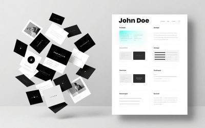
There are also smaller things that quietly lower trust. Putting your photo front and center doesn’t strengthen your work, it introduces bias you don’t control. Skill bars always look confident, right up until you try to understand what they’re measuring. Eighty percent of what, exactly.
Listing basic tools like MS Word or email falls into the same category. If you managed to send your portfolio, that part is already confirmed.
You can see the same thing in CVs. I had someone reach out recently, no portfolio included, just a CV. Clean enough at first glance, but the details started slipping the longer you looked. Spacing slightly off, bullet points not quite aligned, punctuation used inconsistently.
None of those things are dramatic on their own, but together they tell a story.
As a designer, your CV isn’t separate from your work. It is the work. It shows how you handle structure, hierarchy, consistency, all the things you’ll be expected to get right when it actually matters. A CV for a designer should be the one place where alignment issues don’t show up uninvited.
It’s the same with what you choose to include. Listing tools like Canva or Microsoft Office might feel like you’re adding value, but in reality it does the opposite. It tells me you’re filling space instead of focusing on what matters.
A lot of this comes down to a simple shift. Instead of asking what you can add, it’s usually better to ask what you can remove that doesn’t strengthen this.
That’s where most portfolios improve.
When “More” Makes It Worse
The writing is another giveaway. There’s a very specific tone AI-generated text falls into. Once you notice it, it’s hard to ignore. This doesn’t mean you shouldn’t use AI, it means you shouldn’t let it speak for you. If your portfolio reads like it was assembled instead of explained, it creates distance immediately.
Another common mistake is trying to include too much. More projects, more styles, more variety. It feels productive, it usually makes the portfolio weaker. Five clear projects will outperform fifteen vague ones every time. When everything is presented equally, nothing stands out.
Personal projects are where this could be fixed, but they’re often treated like filler. Random brands, no context, no reasoning. This is the one place where you control everything, which means it should be the clearest example of how you think. What were you trying to improve, what did you change, why that direction made sense.
If that’s missing, the work feels empty even if it looks good.
Certificates, Courses, and Reality
Clients don’t really care where you studied. That sounds blunt, it clears things up quickly. You can list as many certificates as you want, it won’t change how your work is judged. People hire you because they can see what you do.
A certificate proves you completed something. Your work proves you understood it.
There are exceptions, some companies require formal qualifications, even then the portfolio carries most of the weight. The certificate might open the door, it won’t carry the conversation once you’re in the room.
Access to learning isn’t the issue anymore either. You can learn almost everything you need from YouTube if you’re paying attention. Typography, layout systems, branding, UI decisions, all broken down by people who actually do the work. The difference isn’t access, it’s whether you apply what you’re watching.
Watching tutorials without applying anything is a bit like collecting recipes and never actually cooking. At some point you have to turn the stove on.
What People Are Actually Looking For
What people are actually looking for isn’t perfection. It’s reliability. Can you take a problem, make a decision, carry it through without constant direction. That’s what makes someone useful in a real project. Strong visuals help, clear thinking is what holds everything together.
AI can support that process. It can speed things up, give you references, help you explore directions faster. What it can’t do is replace judgment. Design is a chain of decisions. If those decisions aren’t being made intentionally, the final result feels off, even if it looks polished at first glance.
The “Do Everything” Trap
There’s also the tendency to try and do everything at once. Logos, social media, UI, packaging, posters. It sounds like flexibility, it usually reads like uncertainty. When everything is equal, nothing becomes memorable. Focusing on one area and going deeper creates a much stronger signal.
Trying to do everything sounds like flexibility, it usually just makes you harder to remember.
There’s More Than One Path
A lot of people think the only path forward is through internships or junior roles inside companies. That path works, it’s just not the only one. In practice, a lot of designers build momentum through smaller client work. One project leads to another. If the work solves real problems, people talk.
That’s how you end up working with clients you’ve never met, in places you’ve never been, without chasing it constantly.
If You Fix Only a Few Things
If you want something practical to take from this, keep it simple.
Show work you can actually explain.
Remove anything you didn’t fully think through.
Focus on a few strong projects instead of trying to cover everything.
Write like you’re explaining your decisions, not trying to sound impressive.
Then just as important:
Don’t rely on AI to make decisions for you.
Don’t pad your portfolio with work that looks finished but isn’t resolved.
Don’t list skills or tools that don’t add trust.
Don’t make people guess what you did.
If someone has to figure it out, you’ve already made it harder than it needs to be.
Final Thought
Most portfolios don’t fail because of a lack of effort. They fail because the effort is placed in the wrong areas. More visuals, more effects, more projects, not enough clarity in the decisions behind them.
Shift that, and everything changes.
If you’re at the point where your work feels close but not quite right, that’s usually where the real progress starts. It’s also where a second perspective helps, especially when the issue isn’t obvious from your side.