Gympie Office Supplies
BRIEF
Industry: Retail
Vision: To provide exceptional stationery products with personalized service, reflecting the historical essence of Gympie, a town with rich gold mining heritage and old-school charm.
Needs: A logo that captures the vintage feel of an old-school stationer/general store, appealing to a diverse customer base ranging from schools to professionals.
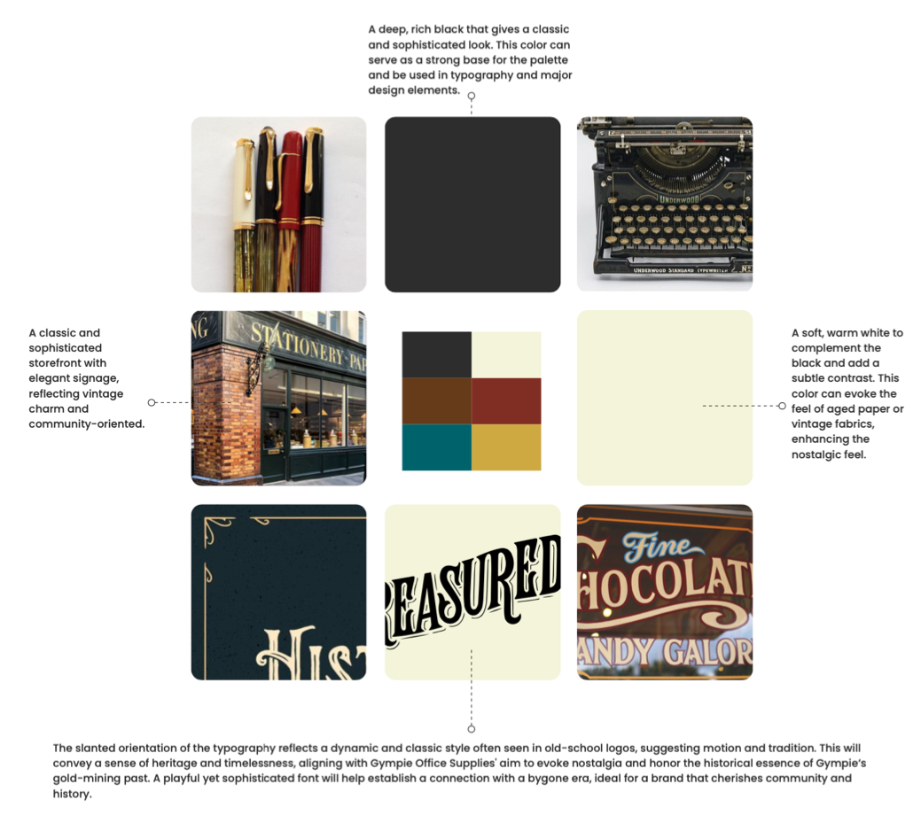
Design Preferences: Sophisticated and traditional with a hint of elegance; vintage or retro styles in black or similar nostalgic colors.
SOLUTION
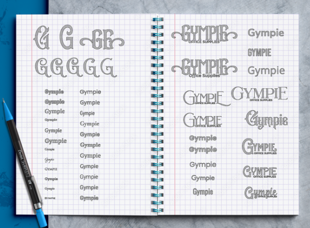
Design Execution: I made a logo that seamlessly blends traditional elements with modern design sensibilities. The logo incorporates:
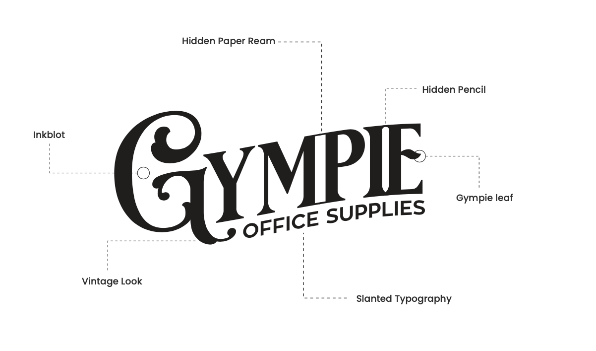
- Vintage Typography: Reflects the classic feel of an old general store, aligning with Gympie’s historical roots.
- Inkblot and Hidden Elements: Introduces a creative, engaging element that hints at the stationery and office supplies niche.
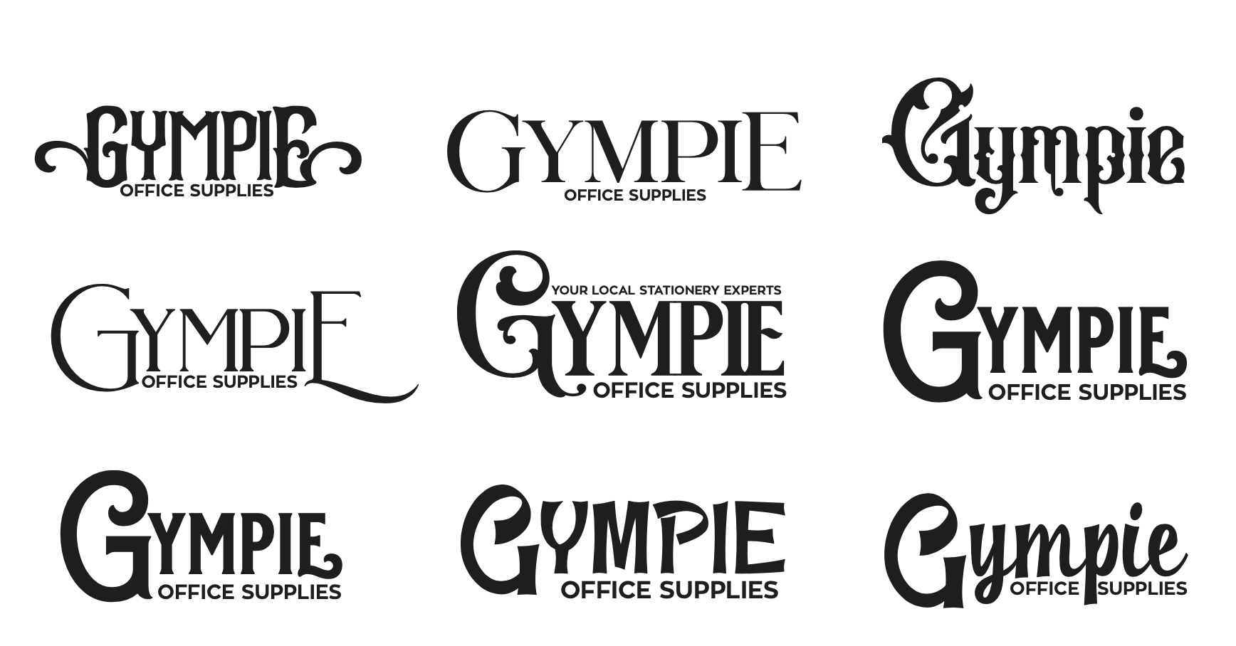
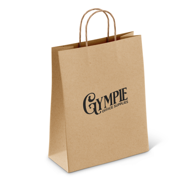
- Comprehensive Design Package: Delivered a full suite of logo variations and usage guidelines, ensuring versatility across both digital and print media.
- Custom Elements: Included specific motifs like a hidden pencil and paper ream within the logo, emphasizing the brand’s focus on stationery.
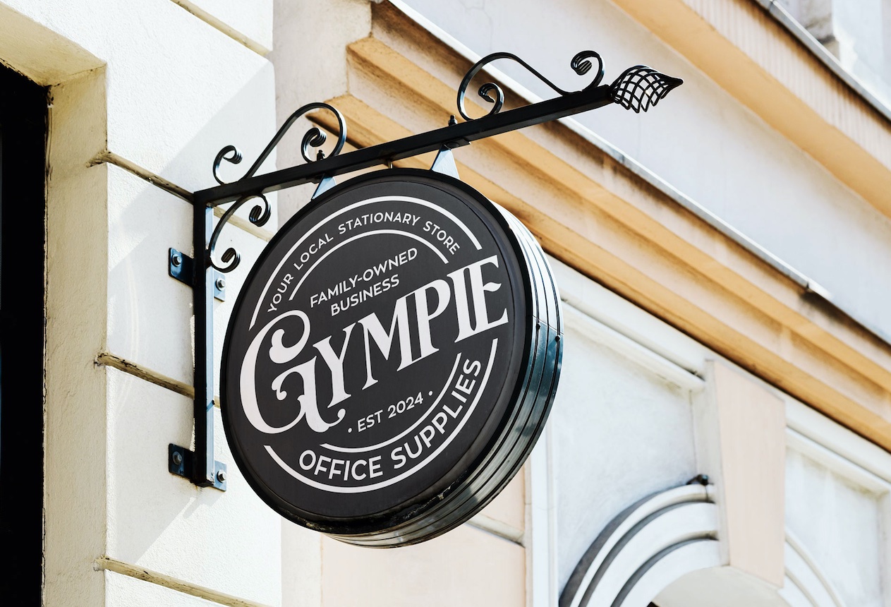
Impact: The final design not only resonates with the local community’s nostalgic vibes but also positions Gympie Office Supplies as a cornerstone for quality and tradition in the area. The logo has enhanced their brand identity, making it more distinctive and memorable in a competitive market.
